
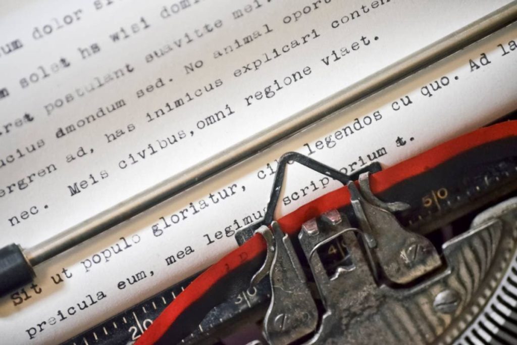
If you’re finally compiling your poetry into a book, and you’re typing out your handwritten scribblings, you will need to decide what font and font size to use. Here’s what we recommend.
The best font size for a poetry book depends on the size of the book and kind of book it is. Generally, most books look best with a sans serif font, with a point size of 10 to 12. Poetry books have less writing per page and thus look better with a slightly larger font size of 12 to 14.
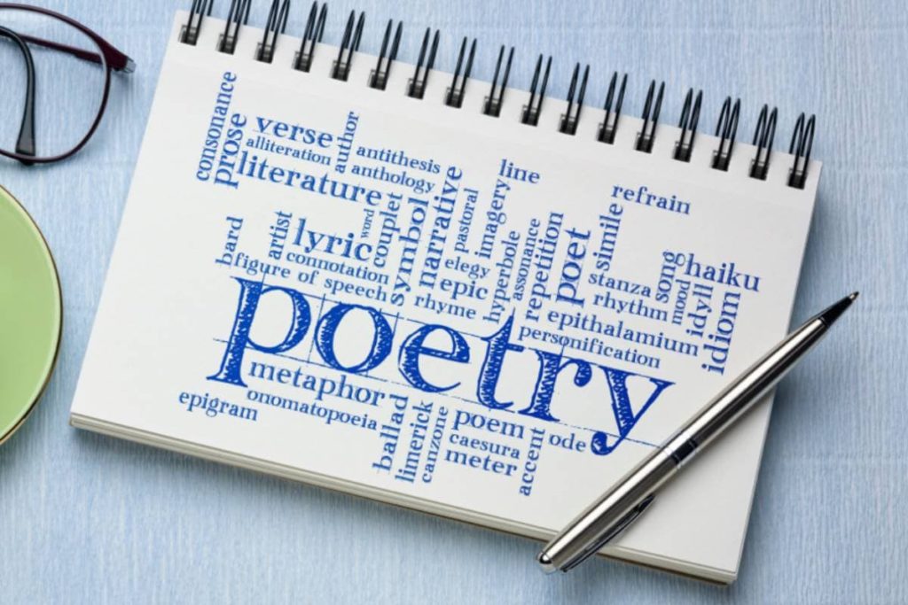
Read on to find out more about font size, font type, and how to find the balance to achieve the ideal readability for your poetry book.
How To Choose the Right Font Size for a Poetry Book
The ideal size for a body font in any book, poetry or otherwise, is around 12pt. However, the font size changes with the type of font being used, even if the point size is precisely the same. This has to do with how a font was initially designed and what it was originally intended for.
Take a look at this article by AshworthCreative about typefaces and why they were created.
Serif vs. Sans Serif
Modern poets favor sans serif fonts over serif fonts. This is because sans serif fonts have a more clean and contemporary feel, in contrast with serif fonts with a more antiquated feel.
Sans serif is also considered more desirable in terms of readability. There’s less fuss and less detail, and it allows the reader to concentrate more on what they’re reading conceptually rather than being distracted by the words themselves. It’s the popular choice for online reading, and its popularity continues to grow for print media over time.
Many still enjoy a serif font for print media, and the best one to use a gentle serif like Artifex.
Different styles within the sans serif family also evoke different emotional reactions in readers. Some styles are somber, playful, wispy and whimsical, while others are heavy and serious.
A good font is like a good soundtrack, as it adds to the overall aesthetic and feeling of the content without you even realizing it’s there. However, even if we don’t entirely take notice of different aspects of typefaces, we unconsciously take in the details of the words we are reading.
These details affect the way we read and how we think about what we read.
The Size Differences Between Serif and Sans Serif
There is an enormous range of sans serif fonts to choose from that differ in size sometimes quite substantially. For example, Verdana in 11pt is larger than Arial in 11pt, and Calibri in 11pt is smaller than Arial in 11pt.
Remember that some sans serif fonts look larger or more “open” than serif fonts due to the lack of details within the lettering.
An overly large font feels clumsy and childlike and might become frustrating for the reader, mainly because it misuses space. A too-small font will be illegible, and the reader will likely not consider the eye strain worth the content.
Fonts Commonly Used by Published Authors
You can use any font that you feel encapsulates the tone and goal of your poetry, but below are some commonly used fonts in published books and poetry that you might like to try out for size:
- Baskerville
- Garamond
- Palatino
- Janson
- Verdana
- Optima
- Helvetica
Helvetica holds the title for the world’s most-used font, while Garamond comes out on top for the number one book font. In your poetry book, other sans serif fonts you may be interested in include:
- Futura, Calibri
- Times New Roman
- Arial
- Cambria
- Franklin Gothic
Cambria, Verdana, and Franklin Gothic are heavier fonts that will better fit a somber tone. Futura, Arial, and Optima are lighter, more spacious sans serifs that lend themselves to a modern and even digital feel.
Helvetica is quite a neutral weight and probably has the best readability of any existing font. Still, it has been criticized for “lacking character.” Baskerville is also a relatively neutral font but has much more character than Helvetica because it’s a serif font with a defined shape.
Do Font and Font Size Really Matter?
The smaller details really do impact the message you are trying to convey with a text.
Letters too close together feel cramped and make the reader feel claustrophobic. Letters that are small and thick have reduced legibility and can make the reader feel like they’re looking at an old historical text, which might deter them from reading it altogether.
In fact, there are entire studies dedicated to the psychology of fonts.
You can read more about this on Cognition Today’s website. It outlines what the different fonts, font sizes, and font weights tell the reader about the text and the emotional reactions a reader might have depending on the font’s characteristics.
The main reason size 12pt is used most is that it’s got the ideal level of readability for a body text. It’s small enough not to be obnoxious but large enough to avoid any strain when reading, and it’s the most neutral font size.
When it comes to selling poetry books, the actual content will, of course, play a much larger role. However, the overall design of a poetry book can significantly improve sales and general interest in your poetry book.
Having a good type design is also crucial in leaving an impression on a reader after reading the book.
If they struggle to read the text physically, it will leave them with a negative impression of the book. They will tell other potential readers about it, which might discourage them from reading or purchasing the book.
Conclusion
The ideal font size for a poetry book is typically 12pt. However, it could be slightly below or slightly above this, depending on the specific font.
The ideal font type is entirely up to individual preference and the message the poet is trying to send. Still, great fonts that many modern poets use are sans serif fonts such as Helvetica, Optima, and Futura.